

Church Street Family & Cosmetic Dentistry
A welcoming website redesign highlights Church Street Family & Cosmetic Dentistry’s team and comprehensive care, making it easier for patients to find treatment information and request an appointment.
Church Street Family & Cosmetic Dentistry Website Redesign
A More Welcoming Digital Front Door
Church Street Family & Cosmetic Dentistry has served Mount Laurel families since 1999. Its previous website no longer reflected the warmth of the practice, the range of care available, or the technology used in the office. The redesign replaced that older web presence with a clear, polished website that makes it easier for prospective and current patients to understand their options and request an appointment.
Project: Website redesign
Industry: Family and cosmetic dentistry
Location: Mount Laurel, New Jersey
Focus: Positioning, information architecture, responsive design, service organization, and appointment conversion
The Challenge
Dental websites have to answer two needs at once. A new patient wants immediate reassurance that the practice is credible, caring, and easy to contact. An existing patient may simply need a form, service detail, insurance information, or the office phone number.
The older site needed a stronger structure for both audiences. The redesign had to:
- Present the practice as established, current, and patient focused.
- Organize a wide range of general, restorative, cosmetic, and preventive services.
- Make advanced dental technology understandable without overwhelming the reader.
- Give the doctors and team a visible role in building trust.
- Put appointment requests, phone details, forms, and practical information within easy reach.
- Work cleanly on mobile for patients searching or calling from a phone.
The Redesign Strategy
The new site is organized around the questions patients ask before contacting a dentist: Who will care for me? What services are available? Will I feel comfortable? How do I make an appointment?
The homepage provides a concise introduction, service routes, confidence-building content, and a prominent appointment form. Interior pages then give each subject enough room to be useful without turning the navigation into a catalog.
The resulting architecture creates clear paths to:
- Family and general dental services
- Cosmetic dentistry
- Restorative care
- Advanced dental technology
- Finance and insurance information
- Patient forms
- Team and practice information
- Appointment and contact options
Visual Direction
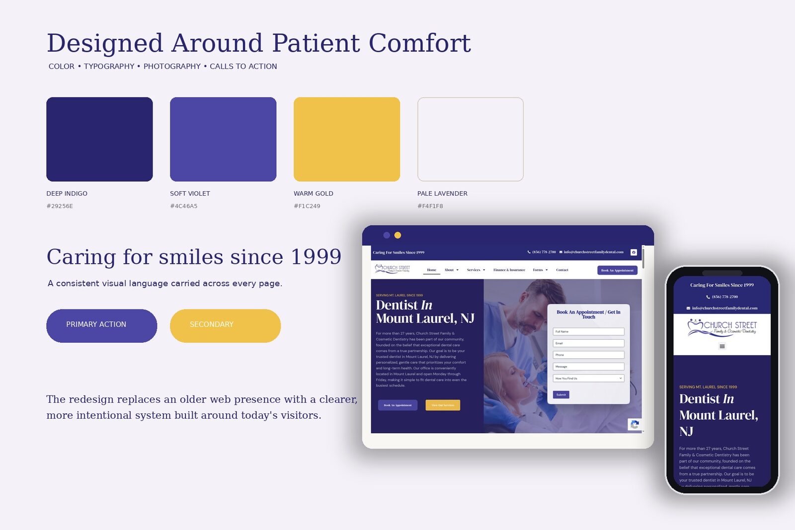
The design pairs deep indigo and soft violet with warm gold accents. The palette feels established and professional while remaining warmer than a typical clinical blue-and-white dental site.
Large serif headlines give the practice a personal, editorial tone. Clean supporting type keeps service explanations and practical information easy to scan. Rounded cards, restrained shadows, and generous spacing help the pages feel calm rather than crowded.
Photography focuses on patients, families, the dental team, and in-office care. The images support the practice’s message of comfort and partnership instead of relying on generic equipment imagery alone.
Key Page Work
Homepage
The homepage introduces the Mount Laurel practice, communicates its history, and places an appointment request directly in the opening section. Patients can move immediately to services or begin an inquiry without searching for a contact page.
Services
The services hub turns a large treatment list into an approachable set of choices. Clear categories and visual cards help patients find the right starting point even when they do not know the exact name of a procedure.
Cosmetic Dentistry
The cosmetic section balances aspirational photography with practical information about bonding, whitening, veneers, Invisalign, and related treatments. Procedure details, benefits, and frequently asked questions support patients who are comparing options before calling.
Advanced Technology
The technology page explains how the practice uses modern tools to improve diagnosis, comfort, accuracy, and treatment. The content is organized in focused sections so technical subjects still feel accessible.
Meet the Team
The team page gives patients a stronger sense of who is behind the practice. Professional biographies and welcoming photography make the first appointment feel more familiar before a patient enters the office.
Contact and Appointment Paths
Appointment calls to action appear consistently throughout the site. The contact experience combines the request form with the phone number, email, location, and office details, reducing the number of steps between interest and action.
Responsive Design
The mobile version is treated as a primary experience, not a reduced desktop layout. Navigation condenses cleanly, headlines remain readable, and the phone number and appointment path stay prominent. Content stacks in a logical order so patients can move from reassurance to service details to contact without losing context.
The Result
The redesigned Church Street website feels aligned with the practice patients meet in person: experienced, attentive, and current. It replaces an aging web presence with a flexible system that can support additional treatments, team updates, and patient resources over time.
The strongest improvement is clarity. Patients can understand the practice, see the breadth of care, learn why its technology matters, and take the next step from any major page.
Straight from the account.
Screenshots from the client’s own Search Console, Analytics and Business Profile. Click any of them to read it full size.
Every number here came out of the client’s own analytics.
No modeled projections, no blended averages. If you want to see the account behind this one, ask — we will walk you through it.
Want a result like this? Let’s talk.
Free strategy session. We’ll show you exactly where the growth is in your market.