
Lysty Aesthetics & Wellness
A polished website redesign brings Lysty Aesthetics & Wellness’s warmth and expertise online, organizing its extensive treatment offerings into clear paths from research to appointment inquiry.
Lysty Aesthetics & Wellness Website Redesign
Project Overview
Lysty Aesthetics & Wellness needed a redesigned website that reflected the level of care offered inside its Huntington practice. The previous web presence no longer represented the breadth of the business or the balance Lysty brings to medical aesthetics: advanced treatment knowledge, a warm bedside manner, and results that still feel natural.
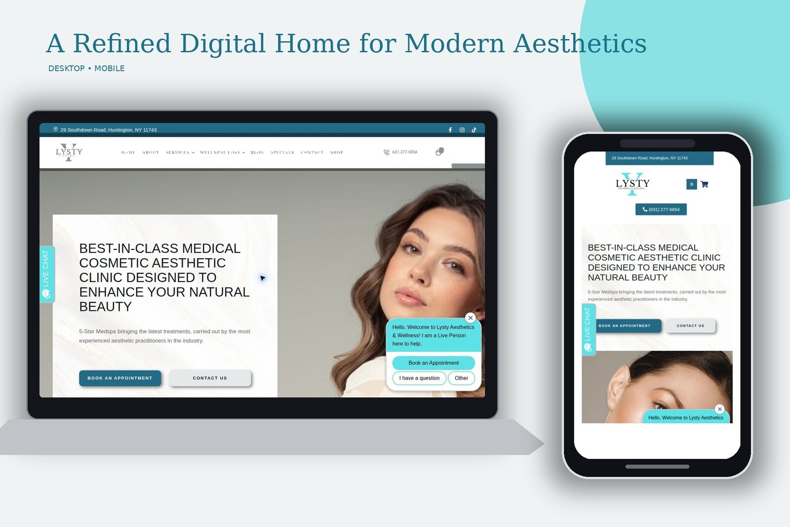
The redesigned site gives the practice a polished digital home with clearer treatment paths, stronger photography, and a more consistent visual identity. Rather than treating the site like a simple menu of procedures, the new structure helps visitors understand the practice, compare options, and move comfortably toward an appointment.
The Redesign Challenge
Medical-aesthetics websites have to do several jobs at once. They must feel elevated without becoming cold, clinical without becoming intimidating, and visually expressive without distracting from safety and provider expertise. Lysty also offers an extensive mix of injectables, skin and laser treatments, facial services, hair restoration, intimate wellness, and wellness or weight-loss options. That amount of information can quickly become overwhelming when every service is presented at the same level.
The redesign focused on organizing that range into clear categories while preserving the personality of the practice. Visitors can begin with the type of care they want, move into a focused treatment page, and find a direct booking or contact option without having to understand clinical terminology first.
Visual Direction
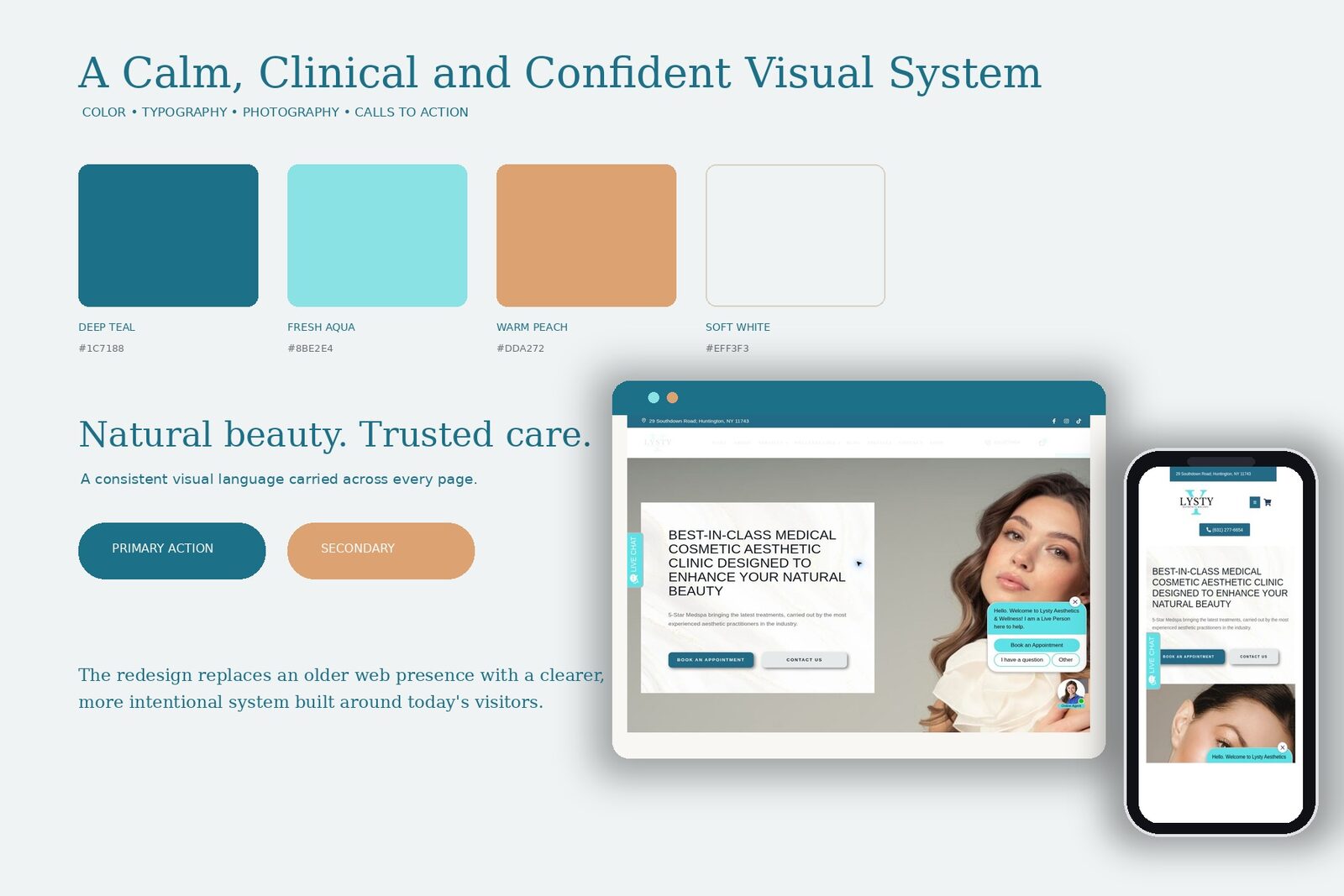
The new design uses a fresh teal and aqua palette supported by warm peach accents and generous soft-white space. Teal gives the site a clean, professional foundation, while the lighter aqua details keep it from feeling overly medical. Peach is used selectively to bring warmth into calls to action and promotional areas.
Large lifestyle and treatment photography gives the site its strongest visual presence. Images are paired with crisp typography and restrained content blocks, allowing the people, services, and outcomes to remain the focus. Rounded shapes, fine borders, and subtle motion add polish without turning the interface into a collection of effects.
Motion was used to reveal content as visitors move through the pages. The animation supports the site’s calm pace and helps longer treatment pages feel more intentional. It is never used as a substitute for information, and the underlying page structure remains clear once each section enters the screen.
Site Organization
The redesigned navigation groups services into recognizable paths. Injectable fillers, skin and laser treatments, hair restoration, facial treatments, intimate wellness, and wellness or weight-loss options each have a defined place. This makes the site useful for visitors who already know the treatment they want as well as those who are still comparing possibilities.
The About page establishes the practice philosophy and introduces the team’s patient-centered approach. Broader treatment pages provide an overview before visitors move into detailed service content. Individual pages can then answer practical questions about the procedure, recovery, pricing, and expected care. Contact and booking actions remain visible throughout the process.
Treatment Content That Supports Decisions
The site’s longer medical-aesthetics pages were designed to hold detailed information without reading like a wall of copy. Headings, treatment images, timing information, recovery guidance, pricing notes, and appointment prompts create a repeatable content system. That consistency is especially important on a site with many related services because visitors can learn how to scan one page and use that same pattern elsewhere.
Facial-treatment content takes a more visual, service-forward approach. Individual options are separated into clear blocks so visitors can compare treatments based on their goals. The design gives each offering enough room to feel distinct while keeping the page connected as one collection.
Responsive Approach
The desktop layout uses wide photography and open spacing to create an upscale presentation. On mobile, the design shifts into a focused single-column flow with simplified navigation, readable type, appropriately sized buttons, and imagery that still carries the personality of the brand. Calls to action remain easy to reach without crowding the smaller screen.
The responsive work was not limited to shrinking the desktop layout. Content order, headline wrapping, spacing, image crops, and interaction areas were considered for the way a prospective client actually browses on a phone. This is especially important for appointment-driven businesses, where many visitors arrive from search or social media on a mobile device.
The Finished Website
The completed redesign replaces an older web presence with a site that feels current, credible, and specific to Lysty Aesthetics & Wellness. It gives the practice room to present an extensive service catalog while still maintaining a clear point of view.
The result is a more cohesive path from first impression to treatment research to appointment inquiry. The new website communicates the professionalism behind the practice, the range of available care, and the warmth clients can expect when they walk through the door, without relying on unsupported claims or generic med-spa design conventions.
Every number here came out of the client’s own analytics.
No modeled projections, no blended averages. If you want to see the account behind this one, ask — we will walk you through it.
Want a result like this? Let’s talk.
Free strategy session. We’ll show you exactly where the growth is in your market.